
Working with RMC-BestFit
In this quick start guide, we will demonstrate how to create a project, enter input data, select a model using the distribution fitting analysis, and perform a Bayesian estimation analysis.
Create a Project
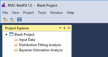
To begin, let’s create a new project. When you open RMC-BestFit, a Blank Project file is automatically created, as shown in Figure. The blank project is stored in your local temp directory. You may begin working with the blank project file immediately.
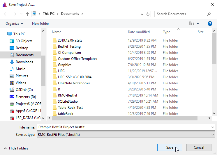
To save changes to the blank project, click the Save button on the tool bar or under the File menu. This will open the Save Project As… prompt. Enter the desired file name and click the save button in the bottom right. Now you are ready to continue working with RMC-BestFit.
A new project can also be created by clicking New Project… under the File menu, or by clicking the New Project button located on the tool bar as shown in Figure and Figure. If this is the first time you're using RMC-BestFit, your recent projects list will be empty.
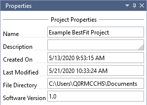
The project properties will be shown in the Properties Window, which is typically located on the right-hand side of the main window. You may edit the project name and description.
Input Data
In RMC-BestFit, the input data must be entered as block annual maxima, which are assumed to be independent and identically distributed (iid). RMC-BestFit supports three different data types:
- Systematic Data: Data that are collected at regular, prescribed intervals under a defined protocol. In a maximum likelihood context, these values are treated as exact measurements. Low outlier tests can be performed on the systematic data to ensure homogeneity.
- Interval Data: Data whose magnitudes are not known exactly, but are known to fall within a range or interval. In a maximum likelihood context, these values are treated as interval-censored.
- Perception Thresholds: Data points that occurred during a period of years and have magnitudes that are below a threshold value, but unknown by how much. In a maximum likelihood context, these values are treated as left-censored.
The Distribution Fitting Analysis chapter provides greater detail on how these data types are treated in a likelihood context.
Create New Input Data
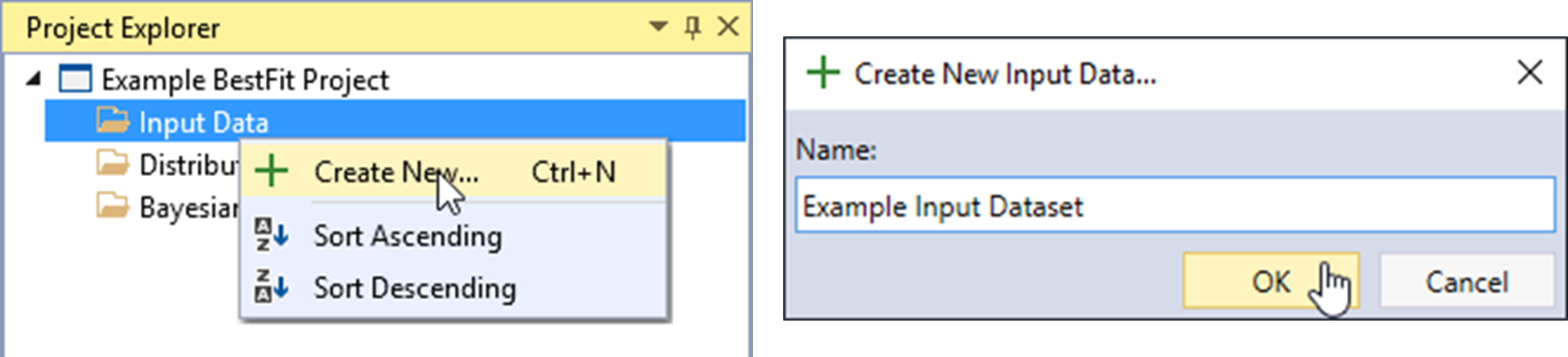
Let’s begin by creating a new input dataset. Right-click on the Input Data folder header and click Create New… as shown in Figure. Next, give the Input Data a name and click OK.
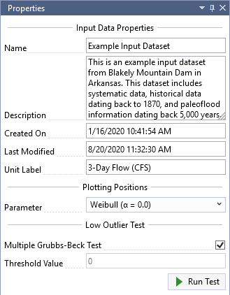
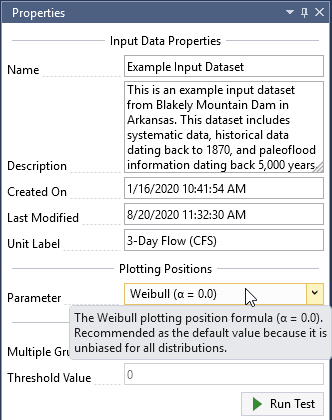
Once the new Input Data is created, it will be automatically opened into the Tabbed Documents area, and the input data properties will be displayed in the Properties Window. From here, you can set the Description, Unit Label, Plotting Position Parameter, and perform a Low Outlier Test.
For this example, we will be using 3-day inflow volumes for Blakely Mountain Dam, which is located near Hot Springs, Arkansas. This dataset includes systematic data, historical data dating back to 1870, and paleoflood information dating back 5,000 years. As shown in Figure, set the Unit Label to be “3-Day Flow (CFS)” and you will notice that this automatically updates the Y-axis labels on the Chronology and Frequency plots.
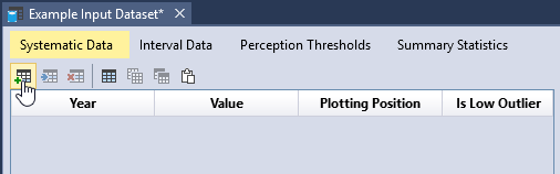
Systematic Data
Systematic data are collected at regular, prescribed intervals under a defined protocol. In a maximum likelihood context, these values are treated as exact measurements. The systematic dataset for Blakely Mountain Dam is provided in Table. Note that the systematic data does not need to be continuous; e.g., the Blakely Mountain dataset has missing data from 1931 to 1935. Gaps in data can be accounted for using thresholds, which will be demonstrated later in the Perception Thresholds section.
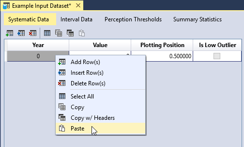
To enter data, first click the Add Row(s) button located on the left side of the table tool bar. This will add a blank row to the bottom of the table. Next, you can either manually enter your dataset, or copy and paste the dataset into the table as shown in Figure. Once you have entered all of the data, you will see that the plotting positions are automatically calculated and the data is plotted in the Chronology and Frequency plot as illustrated in Figure.
| Year | Flow (CFS) | Year | Flow (CFS) | Year | Flow (CFS) |
|---|---|---|---|---|---|
| 1923 | 57,985 | 1959 | 17,032 | 1990 | 30,122 |
| 1924 | 14,607 | 1960 | 45,014 | 1991 | 32,586 |
| 1925 | 8,403 | 1961 | 12,637 | 1992 | 34,357 |
| 1926 | 23,479 | 1962 | 17,037 | 1993 | 32,586 |
| 1927 | 66,629 | 1963 | 9,074 | 1994 | 45,065 |
| 1928 | 30,925 | 1964 | 36,066 | 1995 | 29,547 |
| 1929 | 25,046 | 1965 | 15,261 | 1996 | 14,310 |
| 1930 | 37,772 | 1966 | 23,886 | 1997 | 44,107 |
| 1936 | 9,074 | 1967 | 22,432 | 1998 | 15,676 |
| 1937 | 21,382 | 1968 | 55,536 | 1999 | 18,922 |
| 1938 | 43,769 | 1969 | 43,938 | 2000 | 17,981 |
| 1939 | 50,678 | 1970 | 22,490 | 2001 | 40,097 |
| 1940 | 7,360 | 1971 | 26,955 | 2002 | 42,471 |
| 1941 | 15,617 | 1972 | 53,417 | 2003 | 17,451 |
| 1942 | 23,189 | 1973 | 36,920 | 2004 | 14,964 |
| 1943 | 12,637 | 1974 | 42,584 | 2005 | 20,798 |
| 1944 | 30,064 | 1975 | 39,587 | 2006 | 19,157 |
| 1945 | 52,914 | 1976 | 12,996 | 2007 | 33,729 |
| 1946 | 22,607 | 1977 | 30,294 | 2008 | 58,319 |
| 1947 | 14,191 | 1978 | 8,952 | 2009 | 35,041 |
| 1948 | 19,098 | 1979 | 28,109 | 2010 | 32,700 |
| 1949 | 35,383 | 1980 | 12,637 | 2011 | 35,212 |
| 1950 | 25,046 | 1981 | 15,142 | 2012 | 34,585 |
| 1951 | 13,355 | 1982 | 16,624 | 2013 | 46,921 |
| 1952 | 20,330 | 1983 | 81,464 | 2014 | 15,795 |
| 1953 | 25,701 | 1984 | 13,952 | 2015 | 42,189 |
| 1954 | 26,897 | 1985 | 40,946 | 2016 | 55,982 |
| 1955 | 20,019 | 1986 | 29,317 | 2017 | 34,585 |
| 1956 | 18,240 | 1987 | 24,930 | 2018 | 48,324 |
| 1957 | 21,084 | 1988 | 42,076 | - | - |
| 1958 | 28,886 | 1989 | 26,551 | - | - |
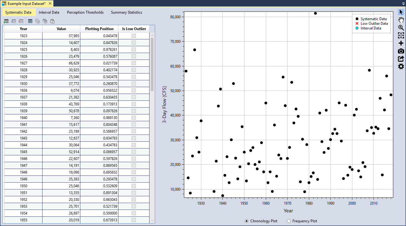
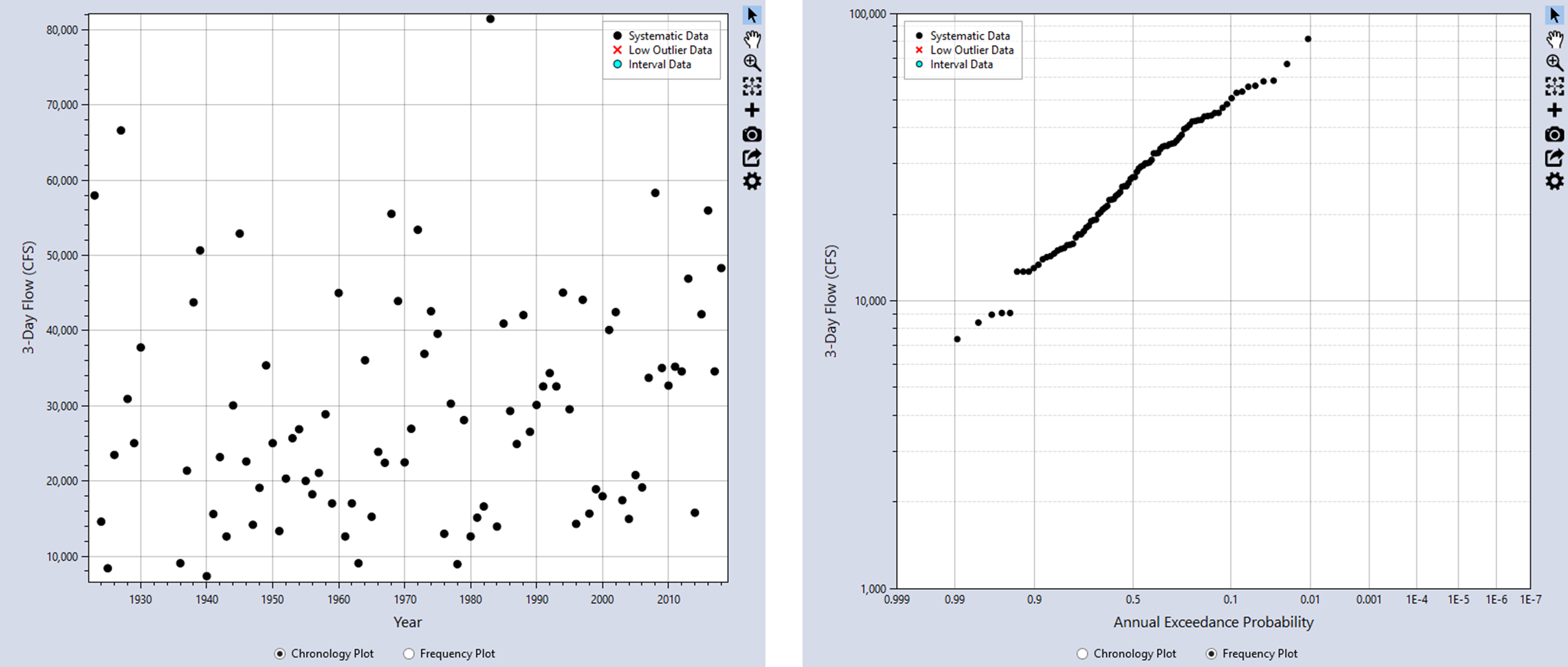
You can view the data as a chronology plot or as a frequency plot by toggling the radio buttons located underneath the plot as shown in Figure. Clicking the Chronology Plot radio button will display the data in chronological order, with the years on the X-axis. The Frequency Plot radio button will display the data as a nonparametric frequency plot based on the Hirsch-Stedinger plotting positions.
Data Table Features
You can edit the data table by using the tool bar located above the table, or by right-clicking within the table. You can interact with the table in the following ways:
- Add rows(s) to the bottom of the table.
- Insert row(s) into the table.
- Delete row(s) from the table.
- Select all table cells.
- Copy the selected cells.
- Copy the selected cells with the table headers.
- Paste from the clipboard into the table.
- Sort a column in ascending or descending order.
- Clear all table sorting.
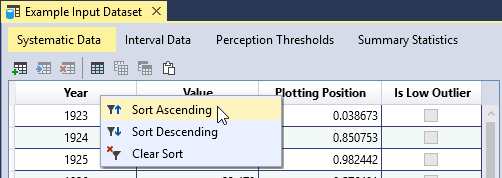
You can sort a column by right-clicking on the column header as shown below.
Data Validation
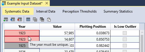
The input data tables have built-in validation. The Systematic Data have the following requirements:
- The year must be unique.
- The year must be between -100,000 and +100,000.
- The value must be non-negative, or greater than or equal to zero.
When you enter invalid data, the table cell will turn red, and provide a tooltip indicating the source of the error. In addition, an error message will appear in the Message Window indicating that you must resolve all errors in the data table.
Plotting Positions
The input data can be plotted as a Chronology Plot or as a nonparametric Frequency Plot as shown in Figure. A frequency plot or probability plot is a plot of magnitude versus a probability. The probability assigned to each data point is commonly determined using a plotting position formula. Plotting positions are a method for creating an empirical frequency. The formula computes the exceedance probability of a data point based on the rank of the data point in a sample of a given size. The plotting positions typically have significant uncertainty due to sampling error resulting from small sample sizes.
A rank-order method is used to plot the annual maxima data. This involves ordering the data from the largest event to the smallest event, assigning a rank of 1 to the largest event and a rank of n to the smallest event, and using the rank (i) of the event to obtain a probability plotting position. Many plotting position formulae are special cases of the general formula:
where:
i = the rank of the event
n = the sample size
α = a constant greater than or equal to 0 and less than 1
Pi = the exceedance probability for an event with rank i
The value of α determines how well the calculated plotting positions will fit a given theoretical probability distribution.
RMC-BestFit uses the Hirsch-Stedinger (H-S) plotting position formula (Hirsch and Stedinger, 1987) [?] (U.S. Geological Survey, 2018) [?], which is an extension of the general formula above that is also capable of incorporating threshold-censored data. The H-S plotting positions are used to visually and quantitatively assess the goodness-of-fit of the fitted distributions (see the Goodness-of-Fit Measures section for more detail).
You can choose from the following parameter options:
- Weibull (α = 0.0): Recommended as the default value because it is unbiased for all distributions.
- Median (α = 0.3175): Provides median exceedance probabilities for all distributions.
- Blom (α = 0.375): Recommended for Normal, Gamma, 2-parameter Log-Normal, 3-parameter Log-Normal, and Log-Pearson Type III distributions.
- Cunnane (α = 0.40): Recommended for Generalized Extreme Value and Log-Gumbel distributions, approximately quantile unbiased.
- Gringorten (α = 0.44): Recommended for Exponential, Gumbel and Weibull distributions.
- Hazen (α = 0.50): Recommended when the parameters of the parent distribution are unknown.
As you can see, each plotting position parameter has a different motivation. Some attempt to achieve unbiasedness in quantile estimates across multiple distributions, while other formulas are optimized for use with a particular theoretical probability distribution. Choosing a plotting position parameter is similar to choosing a probability distribution to represent a particular set of data. It is often better to select a plotting position parameter that is flexible and makes the fewest assumptions. For this reason, the Weibull parameter is set as the default value in RMC-BestFit, which is consistent with current practice.
When you hover over the plotting position drop-down, you will see a tooltip providing the recommended use for the given parameter as shown below.
Low Outlier Test
For the distribution fitting or Bayesian estimation analyses to be theoretically valid, the input data must be independent and identically distributed. As a means to ensure homogeneity, RMC-BestFit provides the Multiple Grubbs-Beck test (MGBT) [?] for low outliers, which is consistent with the Bulletin 17C guidelines [?]. In RMC-BestFit, the MGBT is only applied to systematic data, which are considered exact measurements. Interval- and threshold-censored data are not included in the test.
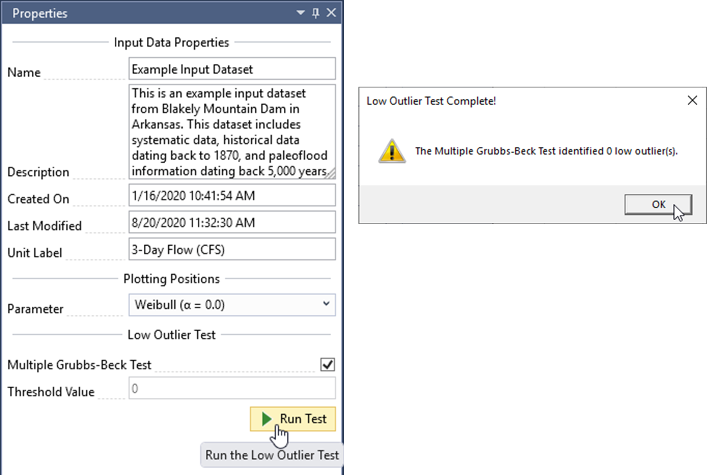
To run the MGBT, make sure the Multiple Grubbs-Beck Test checkbox is checked, and click the Run Test command button. When the test is complete, a message box will appear that reports how many low outliers were identified. In addition, the MGBT Critical Value will be displayed in the Threshold Value textbox. There should be zero low outliers identified for this dataset, so the threshold value should also be set to zero as shown in Figure.
If desired, you also have the option to enter a value for the low outlier threshold. When you run the test, any data value below this threshold will be identified as a low outlier. The Threshold Value cannot be set to a value that would censor more than 50 percent of the values within the data set. To use this option, uncheck the Multiple Grubbs-Beck Test checkbox and enter the preferred value.
Values that are identified as low outliers will be checked in the Is Low Outlier column of the systematic data table. The low outliers will be displayed as a red X in the chronology and frequency plots.
The low outlier threshold value identified by the MGBT or manual threshold value is automatically treated as a left-censored threshold in the distribution fitting and Bayesian estimation analyses. For example, if the low outlier threshold value is 8,000 and there are eight data points below the threshold identified as low outliers, then this is treated equivalent to a left-censored threshold with eight values below and zero above. However, RMC-BestFit does not include the low outlier threshold in the H-S plotting position routine. Conceptually, the low outlier test removes exact data points and replaces them with a threshold-censored value. This represents a loss in information. However, if this low outlier threshold is included in the H-S routine, then it will make the plotting positions rarer, signaling an increase in information. This is counterintuitive, and for this reason RMC-BestFit does not include the low outlier threshold in the H-S plotting position routine.
Interval Data
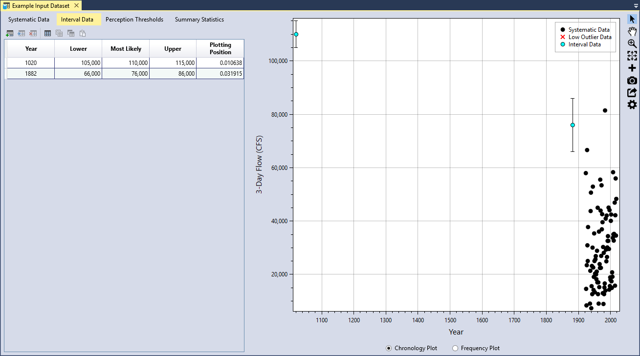
Interval data have magnitudes that are not known exactly, but are known to fall within a range or interval. A paleoflood study was performed for the Blakely Mountain watershed, where two major historical floods were identified: one occurred in 1882 and another occurred sometime around the year 1020.
| Year | Lower | Most Likely | Upper |
|---|---|---|---|
| 1020 | 105,000 | 110,000 | 115,000 |
| 1882 | 66,000 | 76,000 | 86,000 |
You can add the interval data in the same manner as was done for the systematic data. First click the Add Row(s) button located on the left side of the table tool bar. This will add a blank row to the bottom of the interval data table. Next, you can either manually enter the data, or copy and paste the interval data into the table. Once you have entered the data, you will see that the plotting positions are automatically calculated and the intervals are plotted in the Chronology and Frequency plot as vertical bars (see Figure).
The Interval Data have the following requirements:
- The year must be unique.
- The year must be between -100,000 and +100,000.
- The year cannot overlap with any data point in the Systematic Data table.
- The lower, most likely, and upper values must be non-negative, or greater than or equal to zero.
- The lower must be less than the most likely value, and the upper must be greater than the most likely value.
Perception Thresholds
The term perception threshold originates from Bulletin 17C (U.S. Geological Survey, 2018) [?]. For the purposes of RMC-BestFit, a Perception Threshold defines a threshold level over a period of years. Data points that occurred during the threshold period have magnitudes that are below the threshold value, but it is unknown by how much. Conversely, we can also say that if an event occurred during the threshold period, and it had a magnitude larger than the threshold value, then we would have evidence it occurred; i.e., data points larger than the threshold would have been perceived by us.
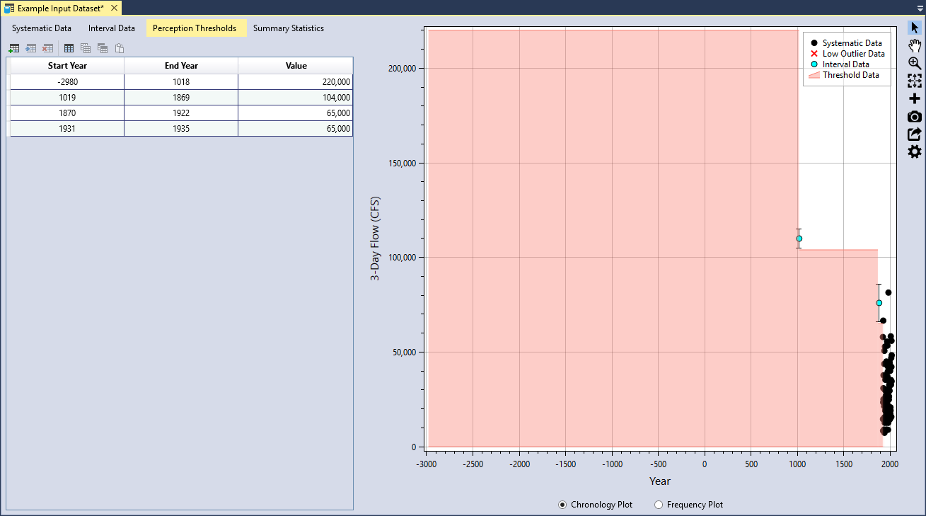
There were four perception thresholds identified for the Blakely Mountain Dam 3-day inflow volume dataset (see Table). The paleoflood study determined that 3-day inflows have not exceeded 220,000 cfs in the last ~5,000 years. Flood volumes did not exceed 104,000 cfs during the years between the paleoflood in 1019 and 1869. From 1870 to the 1922, which is the beginning of the systematic dataset, 3-day flood volumes did not exceed 65,000 cfs, except for the large 1882 event. Finally, 3-day flood volumes during the missing years of systematic data from 1931 to 1935, also did not exceed 65,000 cfs.
| Start Year | End Year | Value |
|---|---|---|
| -2890 | 1018 | 220,000 |
| 1019 | 1869 | 104,000 |
| 1870 | 1922 | 65,000 |
| 1931 | 1935 | 65,000 |
Threshold data is entered in the same manner as was done for the systematic and interval data. Click the Add Row(s) button located on the left side of the table tool bar. Next, you can either manually enter the data, or copy and paste the threshold data into the table. Once you have entered the data, you will see that the plotting positions are automatically calculated and the thresholds are plotted in the Chronology plot as a shaded area (see Figure).
The Perception Threshold Data have the following requirements:
- The start and end years must be between -100,000 and +100,000.
- The start year must be less than or equal to the end year.
- The start and end years of the thresholds must be entered in ascending order.
- The threshold periods cannot overlap with each other.
- The threshold values must be non-negative, or greater than or equal to zero.
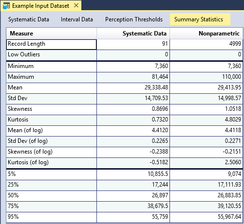
Summary Statistics
RMC-BestFit provides summary statistics for the systematic data and for all of the data, including low outliers, intervals, and perception thresholds (see Figure). Summary statistics for the systematic data are based on the sample moments and percentile estimates, while summary statistics for all data are based on the nonparametric H-S plotting positions. The central moments of the nonparametric distribution are estimated using numerical integration. The nonparametric distribution functions are provided in Equation to Equation. Percentiles are estimated using the inverse cumulative distribution function as shown in Equation.
where is the probability density function (PDF) of the variable ; there is an array of continuous values for with non-exceedance probabilities with .
where is the cumulative distribution function (CDF) of the variable ; is the inverse CDF; and there is an array of continuous values for with non-exceedance probabilities with and .
The summary statistics provide a preview for what to expect when performing distribution fitting or Bayesian estimation. For example, in the case of Blakely Mountain Dam, we can see that the inclusion of historical and paleoflood data slightly increased the skewness of the data. The systematic data has a skewness (of log) of -0.2388; whereas the nonparametric analysis, which includes all of the data, has a skewness (of log) of -0.2151. We should expect to see a similar behavior when fitting the Log-Pearson Type III distribution.
Distribution Fitting Analysis
The Distribution Fitting Analysis in RMC-BestFit uses the method of Maximum Likelihood Estimation (MLE) to fit several univariate probability distributions to the user-specified Input Data. You can use the distribution fitting analysis results to inform model selection for use in the Bayesian estimation analysis. For each fitted distribution, RMC-BestFit provides three goodness-of-fit measures: the Akaike Information Criteria (AIC), the Bayesian Information Criteria (BIC), and Root-Mean Squared Error (RMSE). These measures indicate how well the distribution fits the input data, with a smaller value representing a better fit.
To fit distribution with RMC-BestFit, there are four steps required:
- Define Input Data.
- Run the fitting analysis.
- Interpret the results.
- Select a distribution to use in the Bayesian Estimation Analysis.
Further details of these steps are discussed in the following sections.
Create New Distribution Fitting Analysis
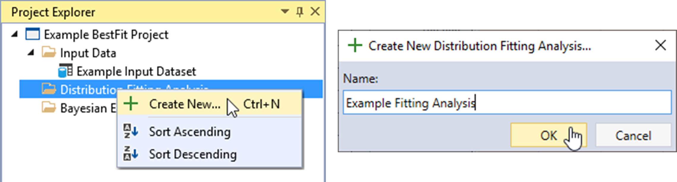
Let’s create a new Distribution Fitting Analysis. Right-click on the Distribution Fitting Analysis folder header and click Create New… as shown in Figure. Next, give the fitting analysis a name and click OK.
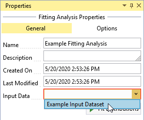
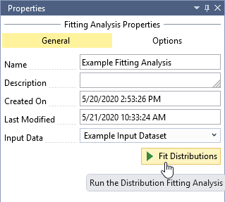
Once the new Distribution Fitting Analysis is created, it will be automatically opened into the Tabbed Documents area, and the fitting analysis properties will be displayed in the Properties Window. From here, you can set the Description, Input Data, Output Frequency Ordinates, and Fit Distributions.
Define Input Data
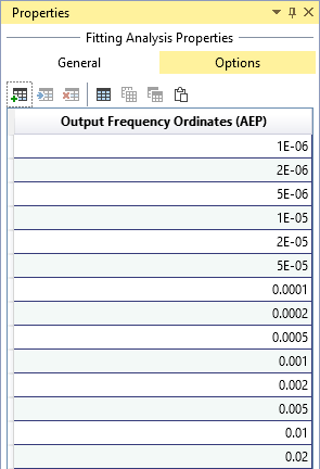
Click the Input Data drop-down and select the desired data for the fitting analysis as shown in Figure. You can set the Output Frequency Ordinates by clicking on the Options tab at the top of the Properties Window as shown in Figure. The output frequency ordinates are the annual exceedance probabilities (AEP) used for plotting the fitted distributions on the frequency plot. The default frequency ordinates range from 0.99 to 1E-6 AEP.
Run the Fitting Analysis
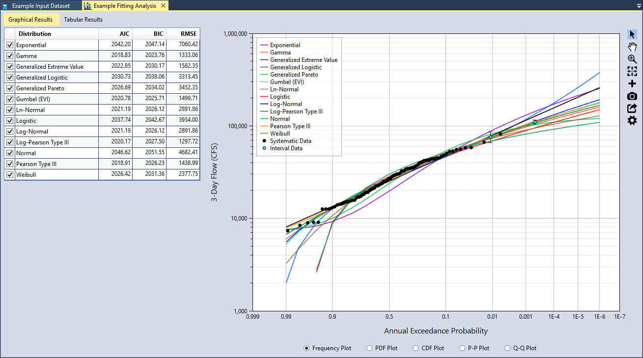
After you have selected the Input Data, click the Fit Distributions command button to run the distribution fitting analysis. The runtime typically takes less than a second. When the analysis is complete, you will see a table of goodness-of-fit measures and all of the distributions plotted on the Frequency Plot as shown in Figure.
Maximum Likelihood Estimation (MLE)
In the distribution fitting analysis, parameters are estimated using the MLE method. The MLE method formulates a likelihood function using sample data and the parameters of the probability distribution, and solves for the value of the parameters that maximize the likelihood function (Rao and Hamed, 2000) [?] (Jongejan, 2018) [?]. The likelihood function gives the probability of the data conditional on the distribution parameters (Equation).
where:
= the sample of systematically recorded annual discharge maxima = the probability density function (PDF) of the variable
Censored data can be incorporated into the MLE method by augmenting the likelihood function. Left-censored threshold data has the following likelihood function:
where:
= the threshold = the threshold period = the number of observations that exceeded the threshold during the period = the binomial coefficient = the cumulative distribution function (CDF) of the variable
The binomial coefficient can be dropped from Equation because it will be held constant as is varied. Interval-censored data has the following likelihood function:
where there are observations known to lie between upper and lower bounds, and . The overall likelihood function is then constructed by multiplying the components:
These likelihood formulations for censored data are consistent with those presented in (Stedinger, 1983) [?], (Kuczera, 1999) [?], and (O'Connell et al., 2002) [?].
From the perspective of Bayesian estimation, MLE is a special case of maximum a posteriori (MAP) that assumes a uniform prior distribution for each model parameter. Therefore, if we assume uniform priors in the Bayesian Estimation Analysis, we will get the same posterior mode as the MLE method used in the Distribution Fitting Analysis (any differences in results would be attributed to convergence errors).
RMC-BestFit uses the Nelder-Mead method (also commonly called the downhill simplex method or amoeba method) to perform MLE for every distribution. The Nelder-Mead method finds the parameter set that maximizes the likelihood function using a direct search method.
Interpret the Results
Once the Distribution Fitting Analysis is complete, you should evaluate the results. RMC-BestFit provides goodness-of-fit measures and comparison graphs to help you evaluate the fits and select the best probability distribution to use in the Bayesian Estimation Analysis.
Goodness-of-Fit Measures
RMC-BestFit provides three goodness-of-fit measures: AIC, BIC, and RMSE. These measures indicate how well the distribution fits the input data, with a smaller value representing a better fit. The goodness-of-fit statistics are used for two purposes:
- Model selection is the process of picking one fitted distribution over another;
- Fit validation is the process of determining whether a fitted distribution agrees well with the data.
AIC and BIC are used for model selection among a finite set of models (the term model is synonymous with probability distribution). The model with the lowest AIC or BIC is preferred. When comparing multiple models, additional parameters often yield larger, optimized log-likelihood values. AIC and BIC penalize for more complex models, i.e., models with additional parameters. However, for BIC, the penalty is a function of the sample size, and so it is typically more severe than that of AIC. The formulas for AIC and BIC are shown in Equation and Equation, respectively. To address potential over-fitting, RMC-BestFit implements a correction for small sample sizes for AIC.
where:
k = the number of parameters
n = the sample size
L̂ = the maximum value of the likelihood function for the model
RSME provides a measure for fit validation, with smaller values indicating a better fit. RMSE is computed based on how well the probability distribution agrees with the plotting positions of the input data. You can set the plotting position parameter based on preference or theoretical motives, so this measure has the potential to be biased. To minimize this issue, the default plotting position coefficient in the input data interface is set to Weibull (α = 0), which is unbiased. The formula for RMSE is as follows:
where:
n = the sample size
ŷi = the predicted value for item i
yi = the observed value for step i
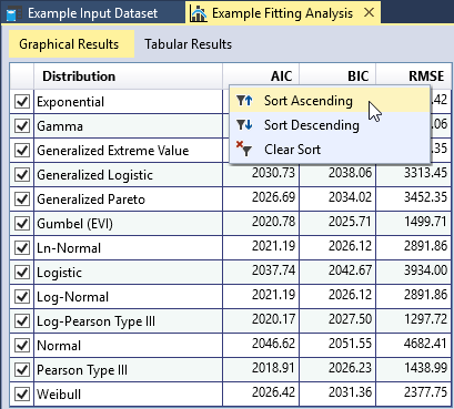
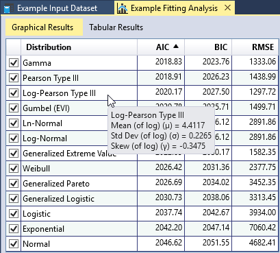
You can sort each column of the goodness-of-fit table in ascending or descending order by right-clicking the column header as shown in Figure. As you move your cursor over the table, a tooltip will appear showing the fitted parameters of the distribution as shown in Figure. You may check or uncheck distributions in this table to add or remove the fitted distributions from the comparison plots.
Comparison Plots
RMC-BestFit provides five types of graphs to help you visually assess the quality of the distribution fits. A comparison graph plots the input data and fitted distributions on the same graph, allowing you to visually compare them. The graphs allow you to determine whether the fitted distribution matches the input data in critical areas. For example, for flood frequency analyses, it is important to have good agreement in the extreme, right-hand tail of the distribution.
Frequency Plot
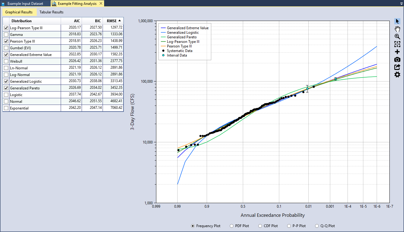
A Frequency Plot is a plot of magnitude versus annual exceedance probability (AEP). AEP is typically plotted on the X-axis using a Normal or Gumbel probability scale to linearize the plot and exaggerate the extreme right-hand tail of the data. The frequency plot compares the fitted distributions to the plotting positions of the input data as shown in Figure.
For demonstration purposes, let’s only evaluate the three-parameter distributions. Uncheck all of the two-parameter distributions in the goodness-of-fit table. Then sort the RMSE column in ascending order as shown in Figure. We see that the Log-Pearson Type III (LPIII) distribution provides the smallest RMSE. In addition, we can also see that it provides a very good fit through the input data plotted in the Frequency Plot. The Pearson Type III (PIII) and Generalized Extreme Value (GEV) distributions also fit through the data well and have a relatively small RSME.
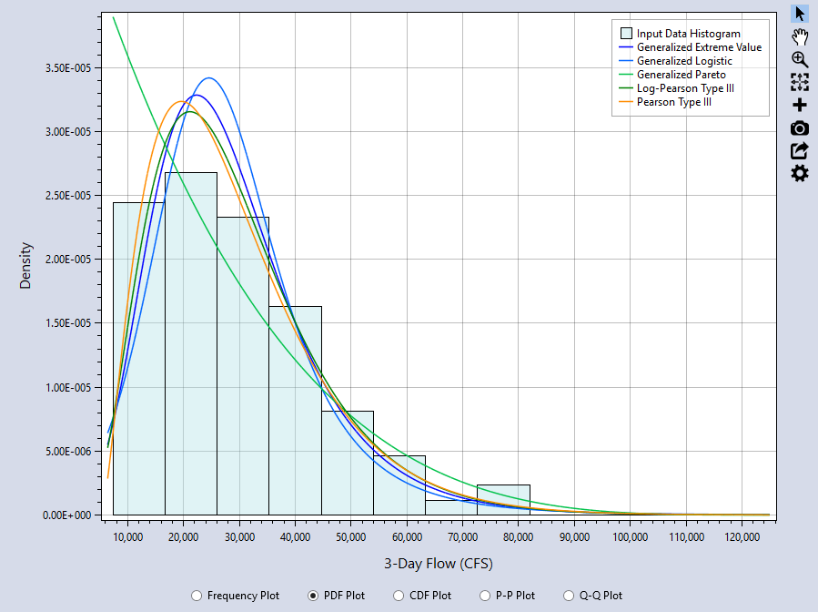
PDF Plot
A PDF Plot compares the probability density function (PDF) of the fitted distribution to a histogram of the input data as shown in Figure. The Frequency Plot and PDF Plot are usually the most informative comparisons. With the PDF plot, it is easy to see the where the highest discrepancies are and whether the general shape of the data and fitted distributions agree well. From the PDF plot, we can see that Generalized Pareto (GPA) distribution does not fit the data as well as the others.
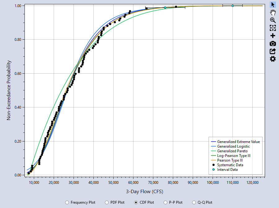
CDF Plot
The CDF Plot compares the cumulative distribution function (CDF) of the fitted distribution to the plotting positions of the input data as shown in Figure. The CDF plot has a very insensitive scale, and is not very useful for comparing the location, spread, and shape of the distributions, for which the PDF plot is much better. In many cases, the CDF plot will not provide a good visual measure for the goodness-of-fit.
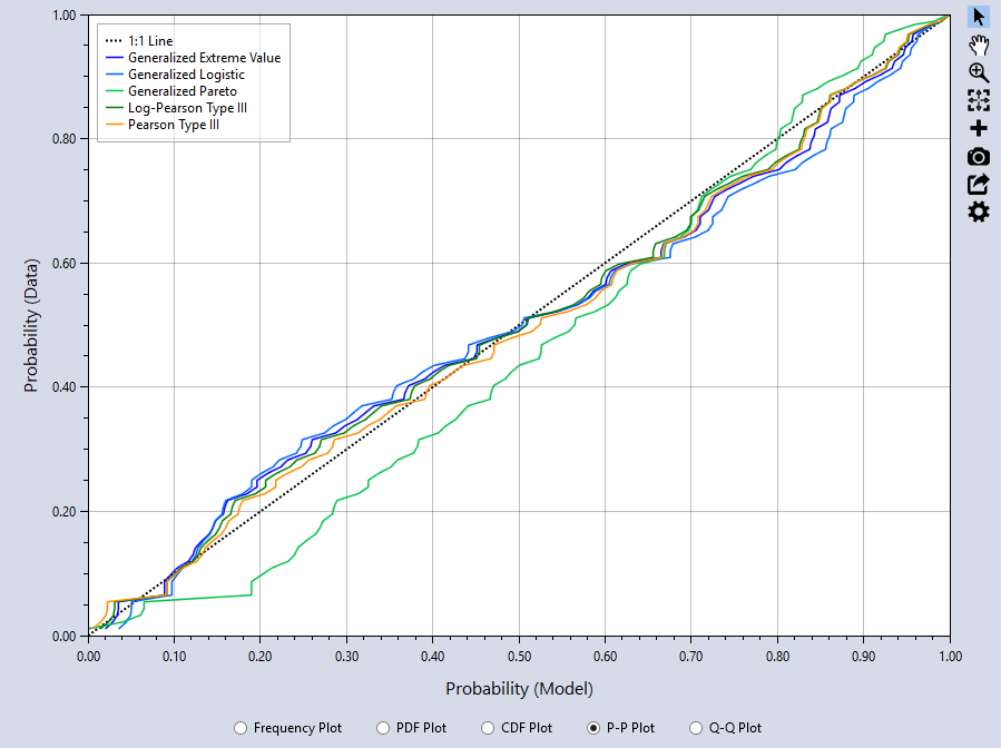
P-P Plot
The Probability-Probability (P-P) plot graphs the F(x) of the model (distribution) versus the input data plotting positions. The closer the plot resembles the diagonal 1:1 line, the better the fit. The P-P Plot can be useful if you are interested in closely matching cumulative percentiles as it showsthe differences between the middle of the fitted distributions and the input data. From the P-P plot, we can see that the GPA distribution has the poorest agreement with the data.
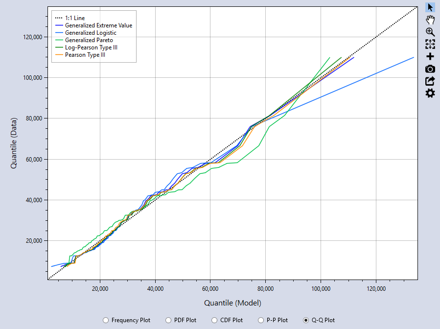
Q-Q Plot
The Quantile-Quantile (Q-Q) plot graphs the inverse CDF of the model versus the percentile values of the input data. Again, the closer the plot resembles the diagonal 1:1 line, the better the fit. The Q-Q Plot can be useful if you are interested in closely matching cumulative percentiles as it shows the differences between the tails of the fitted distributions and the input data. From the Q-Q plot, we can see that the PIII, LPIII, and GEV distributions all fit the right-hand tail of the data really well. The Generalized Logistic (GLO) distribution has the poorest agreement with the right-hand tail of the data, followed by the GPA distribution as the second least favorable fit.
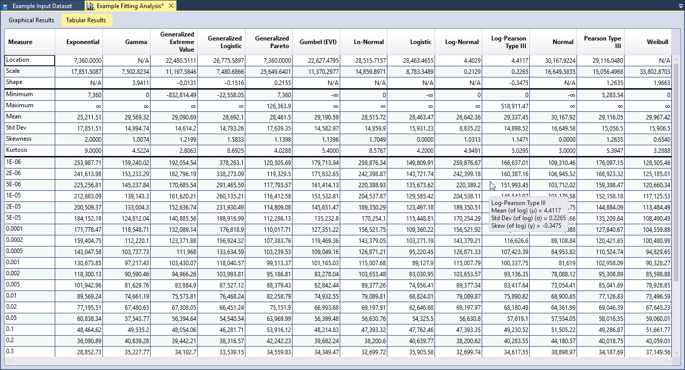
Tabular Results
RMC-BestFit reports the parameters and basic statistics (mean, standard deviation, skewness, etc.) for each of the fitted distributions, which can also be compared to the same statistics for the input data. Quantiles for the specified output frequency AEPs are also provided in the Tabular Results.
Selecting a Probability Distribution
Finally, you need to select a probability distribution to carry forward to the Bayesian Estimation Analysis. The following steps can help you choose an appropriate distribution:
- Start by reviewing the descriptions of the probability distributions found in the Appendix. Then, look at the variable in question. Does the data have bounds? Is it symmetric or skewed? Which distributions are theoretically appropriate for the data?
- Select candidate distributions that best characterize the variable.
- Then, use the Distribution Fitting Analysis results to select the distribution that best describes your Input Data.
In the above example, we evaluated how well the three-parameter distributions fit 3-day inflow data at Blakely Mountain Dam. It was clear that the PIII, LPIII, and GEV distributions produced better fits than the GLO and GPA distributions. Flow data can span several orders in magnitude (e.g., 1,000 cfs to 1,000,000 cfs), and is typically skewed and cannot have negative values. If the skewness of the data is greater than the absolute value of 2 (), then the maximum likelihood estimation method cannot produce a solution for the PIII and LPIII distributions. Real-space flow data can often have skews much larger than 2. Therefore, LPIII better characterizes flow data than the PIII distribution (U.S. Geological Survey, 1982) [?] (U.S. Geological Survey, 2018) [?]. As such, the PIII distribution is not considered appropriate for characterizing the flow data.
When considering the statistical and graphical goodness-of-fit performance, and the appropriateness of the distribution, the LPIII distribution fits the Input Data the better than the GEV distribution. The LPIII distribution will now be carried forward to the Bayesian estimation analysis.
Bayesian Estimation Analysis
RMC-BestFit performs Bayesian estimation using a Markov Chain Monte Carlo (MCMC) algorithm to estimate distribution parameters given the specified input data and parent distribution. The Bayesian estimation method produces the most likely estimate for parameters (posterior mode) and a characterization of the parameter uncertainty.
To perform Bayesian Estimation with RMC-BestFit, there are four steps required:
- Define Input Data and select the parent probability distribution.
- Run the Bayesian Estimation Analysis.
- Diagnose convergence.
- Explore the results.
Further details of these steps are discussed in the following sections.
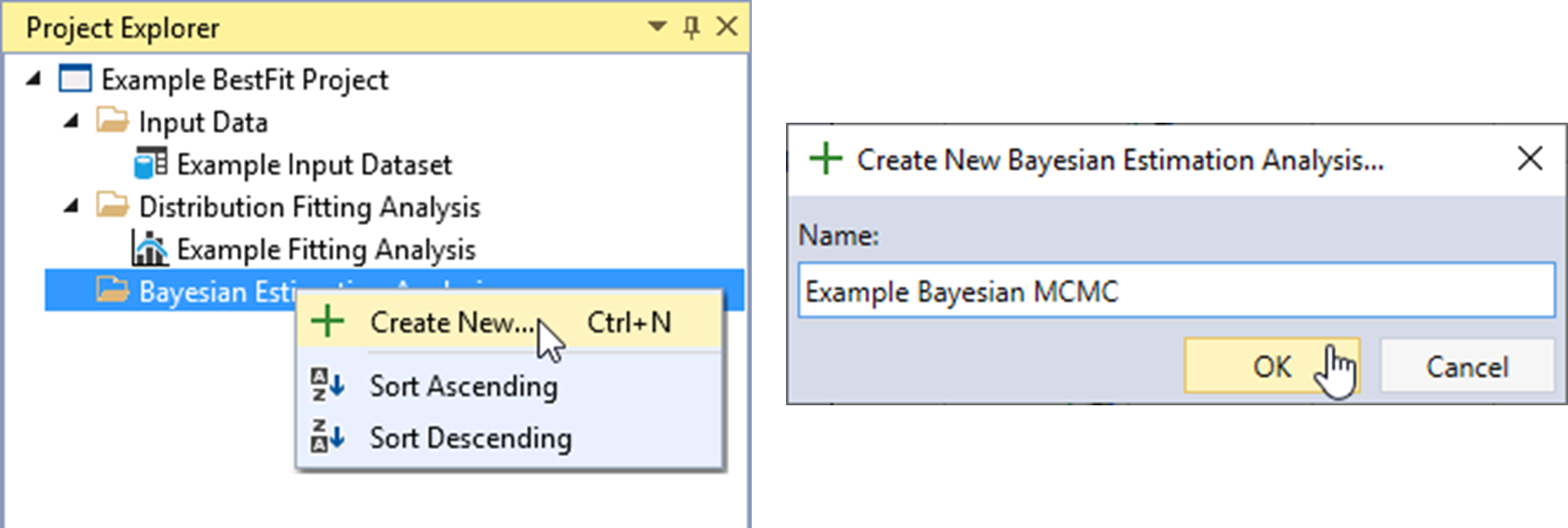
Create New Bayesian Analysis
Let’s create a new Bayesian Estimation Analysis. Right-click on the Bayesian Estimation Analysis folder header and click Create New… as shown in Figure. Next, give the Bayesian analysis a name and click OK.
Once the new Bayesian Estimation Analysis is created, it will be automatically opened into the Tabbed Documents area, and the Bayesian analysis properties will be displayed in the Properties Window. From here, you can set the required inputs.
Bayesian Analysis Framework
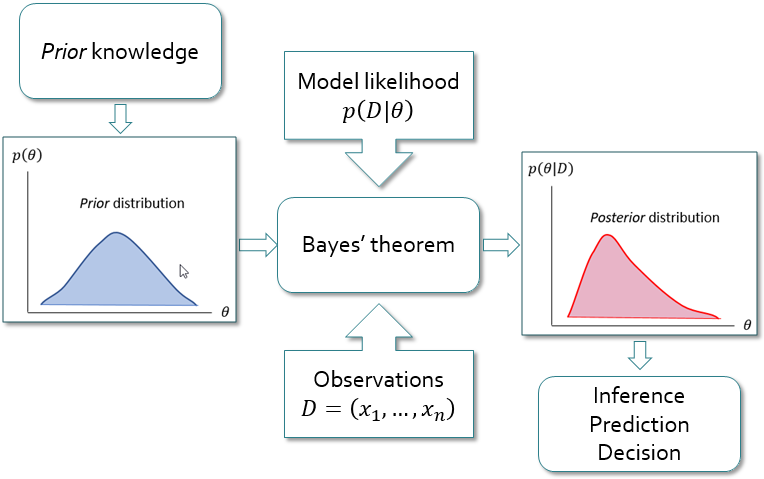
In Bayesian analysis, the values of the parent probability distribution parameters converge to a distribution rather than to a single best value. The uncertainty in the parameters is represented by a prior probability distribution , which is established based on information available a priori. This prior distribution is not derived from the observed data , but instead comes from other sources that can be either subjective (e.g., expert opinion) or objective (e.g., previous statistical analyses, or regional information). After the prior distributions and the observed data are specified, Bayes’ theorem (Equation) is used to combine the a priori information about the parameters with the observed data, using the likelihood (Equation).
where:
= the posterior probability density function (PDF) of = the prior PDF of = the likelihood function.
The posterior cumulative distribution function (CDF) of now follows from the total probability theorem:
which is a probability-weighted sum of the CDFs under different posterior parameter sets. Equation is known as the Bayesian posterior predictive distribution and is equivalent to the expected probability of exceedance concept first presented by (Beard, 1960) [?].
(Stedinger, 1983) [?] and (Kuczera, 1999) [?] refer to this integral as the design flood distribution, and it is considered the optimal estimator of an exceedance probability.
In most cases, there is not a closed form solution to the denominator of Equation. Therefore, Monte Carlo simulation techniques such as Markov Chain Monte Carlo (MCMC) are required. The RMC-BestFit software employs an adaptive Differential Evolution Markov Chain (DE-MCz) population-based sampler (ter Braak and Vrugt, 2008) [?], which has proven to be very efficient at arriving at the posterior distribution.
Figure illustrates the basic steps in Bayesian analysis. The Bayesian approach offers a framework that is well suited to incorporate different sources of information, such as systematic records, historical data, regional information, and other information along with related uncertainties (Viglione et al., 2013) [?]. The Bayesian approach allows you to formally include your own expertise into the analysis by choosing a priori distributions. The possibility to combine this information with the observed data is even more important because, in practice, the observed records are usually of limited size.
Define Inputs
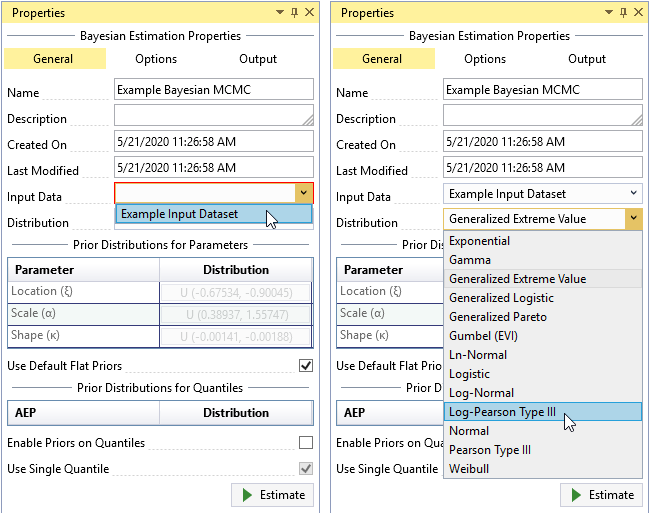
You must select the Input Data and the parent probability distribution to use in the Bayesian Estimation Analysis. The parent distribution describes the parent population of your Input Data, which is assumed to be a sample from the parent population. By default, the parent distribution is set as the Generalized Extreme Value (GEV) distribution.
To select your data, click the Input Data drop-down on the General tab and select the desired data for the Bayesian analysis as shown in Figure. Next, set the parent distribution to be the distribution selected from the Distribution Fitting Analysis, which in this case was Log-Pearson Type III (LPIII). The prior distributions for parameters and quantiles can also be set from the General tab.
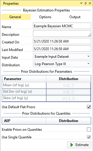
Default Flat Priors
After you have selected the Input Data and parent distribution, RMC-BestFit automatically develops default flat (uniform) priors for the selected distribution, given the data. The goal of this routine is to develop prior distributions that have minimal impact on the posterior distributions. This approach is sometimes referred to as vague priors, or weakly informative priors. Weakly informative priors contain information to keep the posterior within reasonable bounds without fully capturing one’s scientific knowledge about the underlying parameter (Gelman et al., 2014) [?]. There are two approaches to developing a weakly informative prior as described by (Gelman et al., 2014) [?]:
- Start with some version of an uninformative prior distribution and then add enough information so that inferences are constrained to be reasonable.
- Start with a strong, highly informative prior and broaden it to account for uncertainty in one’s prior beliefs and in the applicability of any historically based prior distributions to new data.
RMC-BestFit develops default flat priors by first considering the parent distribution and parameter support, and then peeking at the data to determine broad upper and lower constraints for the parameters. This ensures the prior distributions for parameters are somewhat centered near the likelihood, but with a much larger spread. The typical end-user of RMC-BestFit will likely not have much advanced training in Bayesian statistics. Therefore, the routine for default flat priors ensures you will get reasonable results out of the box.
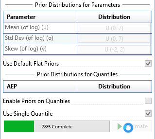
The default flat priors are shown in Figure. You may uncheck the Use Default Flat Priors checkbox to customize the priors. See the Informative Priors section for details on how to set informative priors for parameters and quantiles.
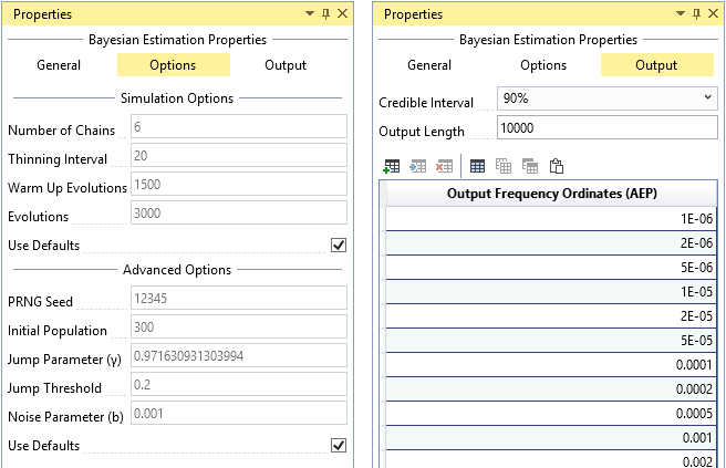
Simulation Options
For typical applications, the default simulation options should provide reasonable results out of the box. The Bayesian Estimation Analysis has the following simulation options (see Figure) available for advanced users:
- Number of Chains: The Bayesian Estimation Analysis utilizes an adaptive Differential Evolution Markov Chain (DE-MCz) population-based sampler (ter Braak and Vrugt, 2008) [?], in which multiple chains are run in parallel. It is recommended that the number of chains be 2 times the number of parent distribution parameters.
- Thinning Interval: Determines how often the Markov Chain Monte Carlo (MCMC) evolutions will be recorded. Thinning can be used to reduce autocorrelation in the posterior distributions. A thinning interval of 20 means that every 20th iteration will be recorded.
- Warm Up Evolutions: The number of thinned warm up MCMC evolutions to discard at the beginning of the simulation. It is recommended that the warm up be half the length of the number of evolutions; e.g., if the number of evolutions is 4,000, then the warm up length should be 2,000.
- Evolutions: The number of thinned MCMC evolutions to simulate. If the thinning interval is 10 and the number of evolutions is 1,000, there will be a total of 10,000 iterations in the simulation. It is recommended to simulate at least 3,000 thinned evolutions.
- PRNG Seed: The pseudo random number generator (PRNG) seed used within the Monte Carlo simulation. The PRNG ensures repeatability.
- Initial Population: Determines the length of the initial population vector. It is recommended that the initial population be at least 100 times the number of parent distribution parameters in length.
- Jump Parameter (γ): The jump parameter allows the simulation to jump from one mode region to another in the target distribution. It is recommended to set , where d is the number of parent distribution parameters.
- Jump Threshold: Determines how often the jump parameter (γ) switches to 1.0. It is recommended that the jump threshold be set to 0.20, which will result in adaptation 20% of the time.
- Noise Parameter (b): A random noise is added to the proposal in the MCMC simulation. The noise follows a uniform distribution . It is recommended that b be very small, such as 0.001.
The simulation options are automatically set with default settings. You can uncheck the Use Defaults checkbox to customize the settings.
Output Options
The Bayesian Estimation Analysis has the following output options (see Figure):
- Credible Interval: Sets the width of the credible interval. For a 90% credible interval, the value of interest lies with a 90% probability in the interval.
- Output Length: The number of posterior parameter sets to output. It is recommended to output 10,000 parameter sets to ensure an accurate 90% credible interval.
- Output Frequency Ordinates: The annual exceedance probabilities (AEP) used for plotting the results on the frequency plot. The default frequency ordinates range from 0.99 to 1E-6 AEP.
Run the Bayesian Analysis
After you have defined all of your inputs and settings, click the Estimate command button to run the Bayesian analysis. The runtime typically takes on the order of 30 seconds, depending on your computer configurations. A progress bar will appear to the left of the Estimate command button as shown in Figure. When the analysis is complete, you will see the frequency curve with credible intervals appear in Frequency Results plot located in the Tabbed Documents area.
Diagnose Convergence
After you have run the Bayesian Estimation Analysis, RMC-BestFit provides several useful plots for diagnosing the simulation convergence. The default simulation option (see Simulation Options) will typically ensure that you get reasonable results. However, there may be situations where you would like to adjust the simulation options to reduce runtimes while still achieving accurate results.
The Bayesian Estimation Analysis will open to the Frequency Results tab by default because this information is of most useful for a typical user. However, let’s start from the bottom and work upward by first clicking on the Markov Chain Traces tab as shown in Figure.
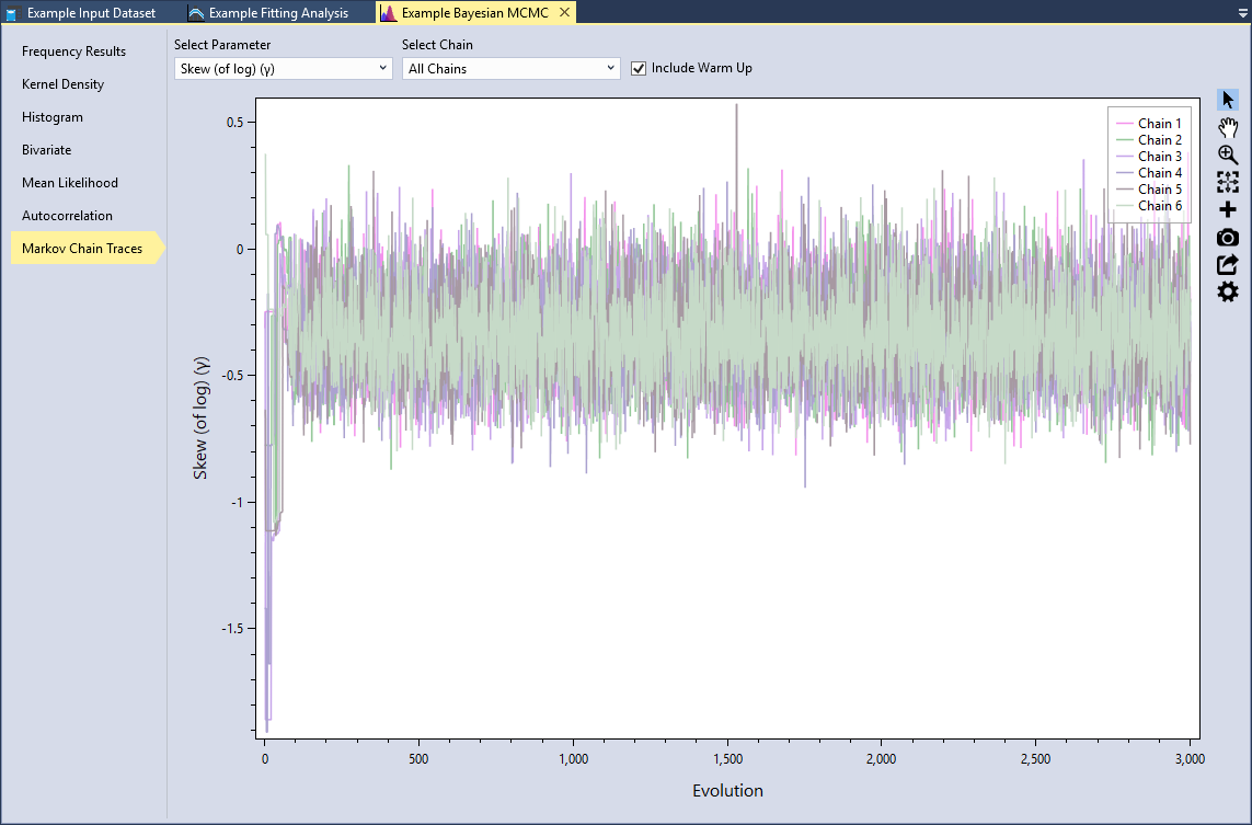
Markov Chain Traces
Trace plots provide an important tool for assessing the mixing of a Markov chain. The trace plot is a time series plot of the Markov Chain iterations. The trace plot shows the evolution of a parameter vector over the iterations of one or all chains. You can select the distribution parameter and which chain(s) to view. In addition, you can include the warm up evolutions. Let’s select the Skew (of log)(γ) parameter and All Chains and check the Include Warm Up checkbox, as shown in Figure.
We can see that for the first 100 or so evolutions, the sampler is warming up and has not yet converged. After that point, we see that the MCMC sampler seems to be mixing well because all of the chains are exploring the same region of the parameter space.
What you want to look for is any anomaly in the traces. Are there any chains significantly different from the others? Is there multimodality? In other words, do the traces jump from one modal region to another? These would be signs of poor mixing, and would indicate that you need to increase the number of evolutions.
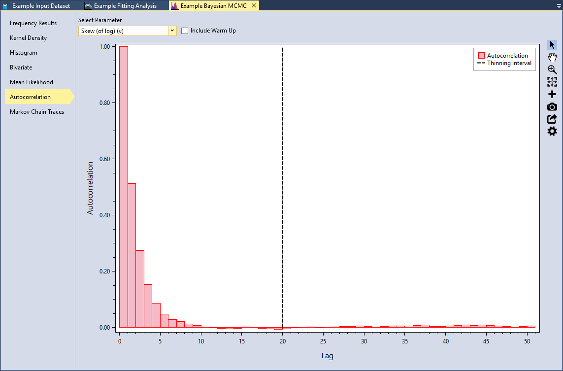
Autocorrelation
Another way to check for convergence is to look at the autocorrelations between the MCMC samples. MCMC samples are dependent, so there will be correlation among each consecutive iteration. This will not affect the validity of inference on the posterior samples so long as the sampler has time to fully explore the posterior distribution. However, autocorrelation will affect the efficiency of the sampler. In other words, highly correlated chains require more samples to produce the same level of precision for an estimate. Since autocorrelation tends to decrease as the lag increases, thinning samples will reduce the final autocorrelation in the sample while also reducing the total number of saved MCMC iterations required.
Select the Autocorrelation tab and select the Skew (of log)(γ) parameter as shown in Figure. This plot shows the lag-k autocorrelation between every sample and the sample k steps before. The autocorrelation should decrease as k increases. When the autocorrelation is zero, the samples can be considered independent. Conversely, if the autocorrelation remains high for higher values of k, then this indicates a high degree of correlation between samples and slow mixing.
The Thinning Interval is set to 20 by default in the simulation options. We can see that this ensures we get good mixing and near zero autocorrelation.
Mean Likelihood
Another way to check for convergence is to see if log-likelihood function is stable. Select the Mean Likelihood tab. We can see that during the first 100 or so evolutions, the sampler is warming up and has not yet converged. As we previously saw in the Markov Chain trace plot, all of the chains are exploring the same region of the parameter space, which leads to a very stable mean log-likelihood.
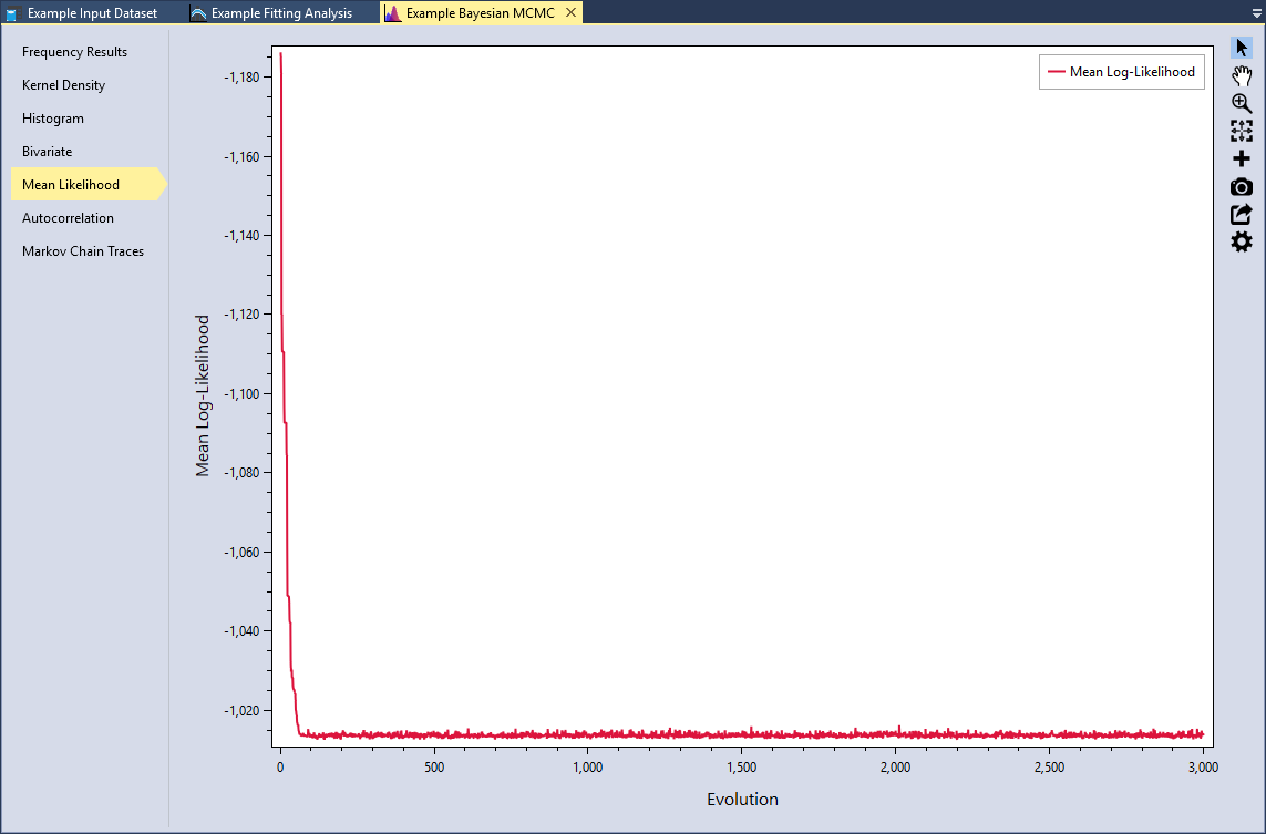
It is recommended that you do not rely on a single diagnostic measure. It is important to use a weight-of-evidence approach and view many different diagnostics. After examining these plots, we can be confident that the MCMC simulation has converged. Now let’s explore the results.
Explore Results
RMC-BestFit provides several tools for exploring the results of the Bayesian analysis. The Bayesian Estimation Analysis will open to the Frequency Results tab by default as shown in Figure.
Frequency Results
The posterior predictive distribution, posterior mode distribution, and the credible intervals will be plotted on the Graphical Results tab. By default, the posterior parent distribution is plotted as a frequency curve, with annual exceedance probabilities plotted on the X-axis using a Normal scale, and magnitude on the Y-axis using a logarithmic scale. You may edit the plot properties, flip the axes, or changing the axes scales as desired. RMC-BestFit will save and persist all of the changes you have made to the plot.

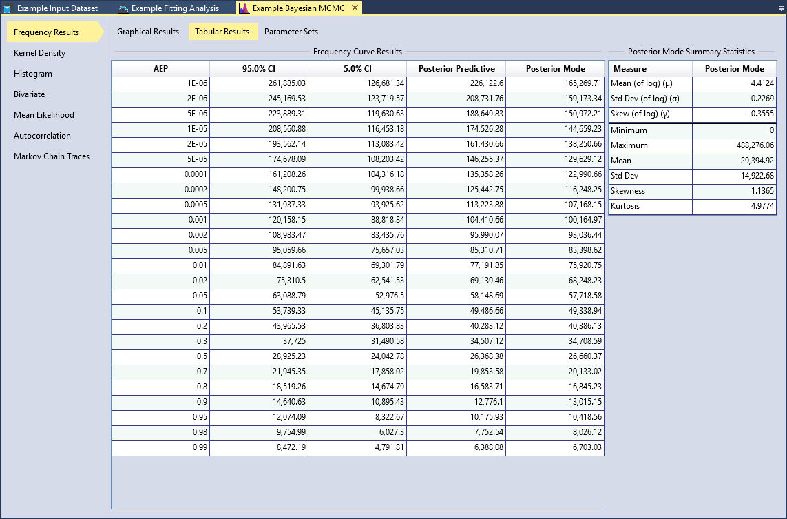
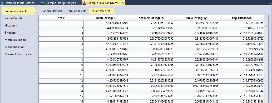
Click the Tabular Results tab to view the frequency curve results and the posterior mode summary statistics as shown in Figure. All of the outputted posterior parameter sets and associated log-likelihood values are available on the Parameter Sets tab as shown in Figure. You may sort these tables, and copy all of the values for external use.
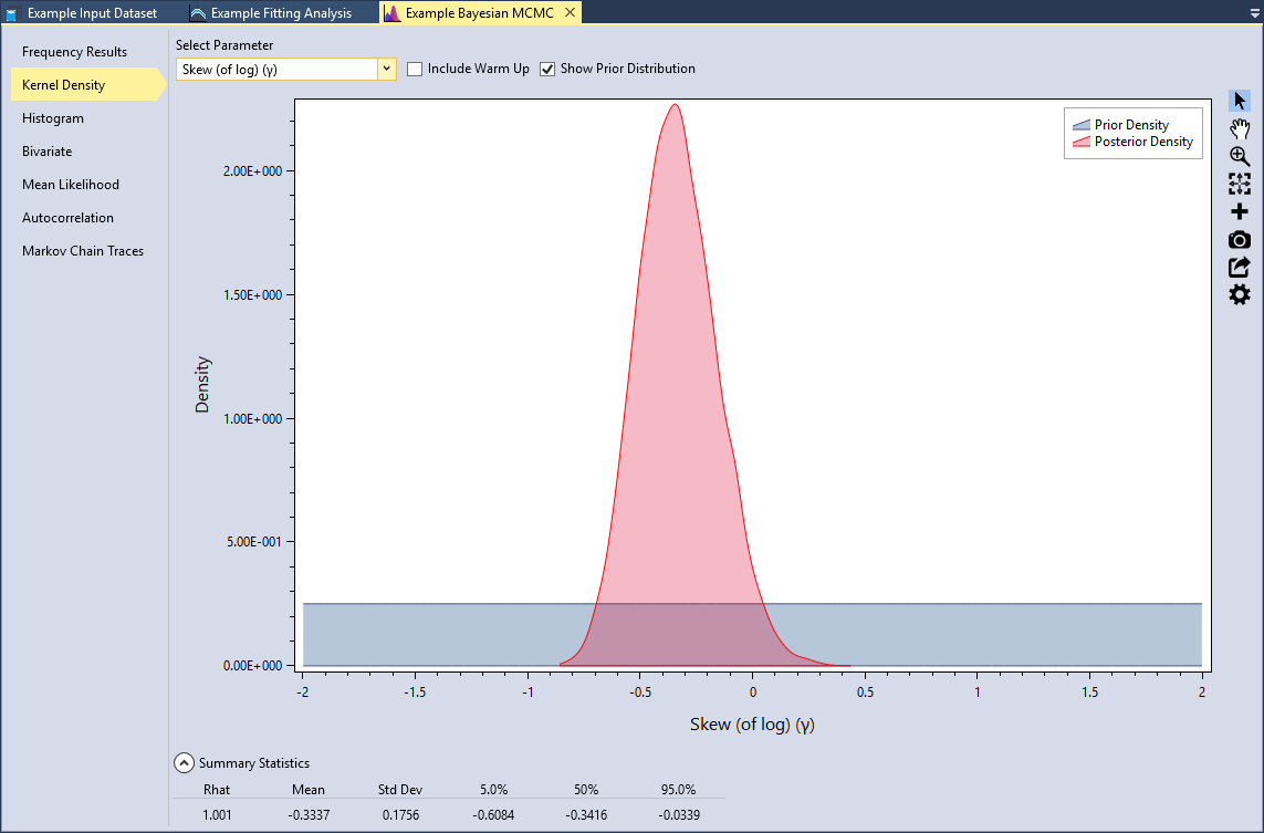
Kernel Density
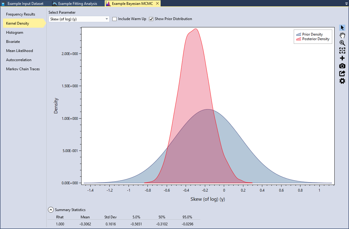
RMC-BestFit provides kernel density plots of the marginal posterior distribution of parameters. Kernel density estimates are closely related to histograms, but provide smoothness and continuity. Select the Kernel Density tab, select the Skew (of log)(γ) parameter, and check the Show Prior Distribution checkbox, as shown in Figure. Recall that the prior for skew was set as a uniform distribution .
Underneath the plot, you can expand the Summary Statistics for the marginal distribution. Here we can see that the mean of the skew (of log) parameter is -0.3337 with a standard deviation of 0.1756. You will also notice that there is a statistic labeled Rhat. This is often referred to as the Gelman-Rubin statistic, which assesses the mixing of the Markov chains using the between- and within-chain variances (Gelman et al., 2014) [?]. A Rhat equal to 1.0 indicates that the posterior distribution has likely converged.
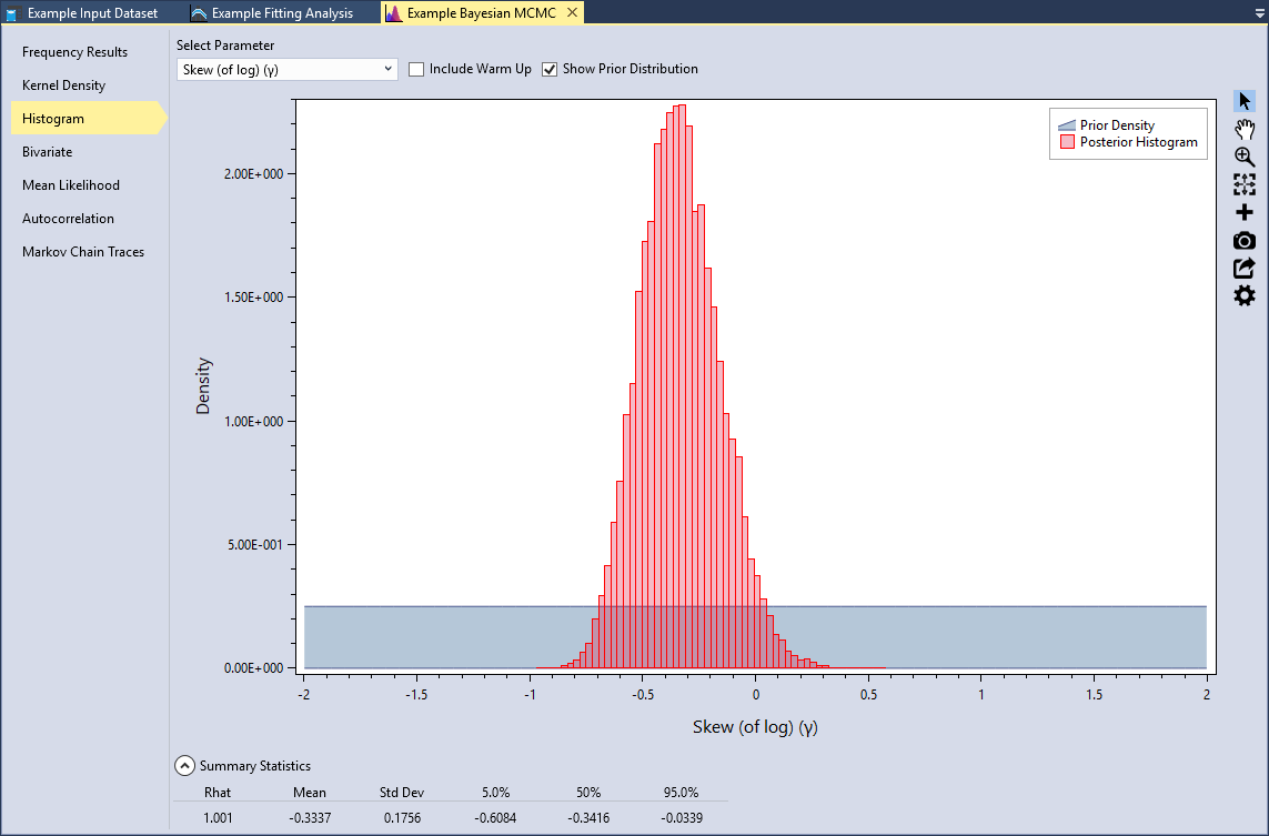
Histogram
RMC-BestFit also provides histograms of the marginal posterior distribution of parameters. These plots provide the same information as the kernel density plots. The histogram bins are set using the Rice rule , where is the number of bins, and is the number of posterior parameter sets.
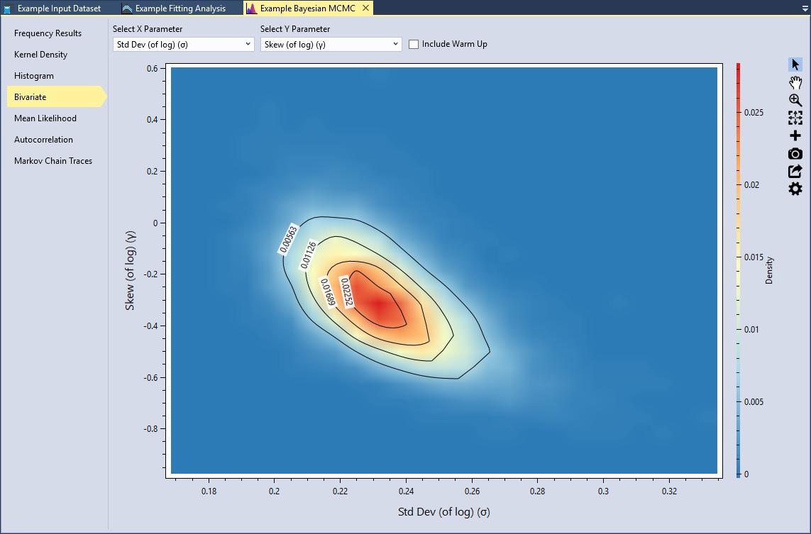
Bivariate
RMC-BestFit provides the option to view the marginal posterior density functions for any pair of parameters as a two-dimensional heat map, with the color red indicating the highest density and blue indicated lowest density. Bivariate plots illustrate the dependence among the parent distribution parameters.
Typically, the higher order parameters are dependent on the lower order parameters. Set the X Parameter to be the Std Dev (of log) (σ) and the Y Parameter to be Skew (of log)(γ), as shown in Figure. We can see that standard deviation is negatively correlated with skew. Smaller standard deviations result in higher skews; whereas higher standard deviations results in lower skews. This tradeoff in parameters is typical with the LPIII distribution.
Informative Priors
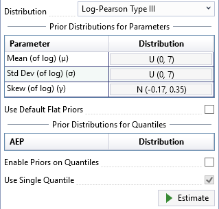
An informative prior provides specific, scientific information about the parameter. Prior information can be obtained from regional analysis, causal modeling, or expert elicitation. In flood frequency, an example of an informative prior would be the use of a regional skew (Kuczera, 1983) [?] for the LPIII distribution as described in Bulletin 17B (U.S. Geological Survey, 1982) [?] and 17C (U.S. Geological Survey, 2018) [?].
For the Blakely Mountain Dam, regional skew information was obtained from a USGS regional study of Arkansas, Oklahoma, and Louisiana (Wagner et al., 2016) [?]. From the USGS study, the regional skew was determined to be -0.17 with a mean-square error (MSE) of 0.12. This information can be incorporated into the Bayesian analysis by setting the prior for the skew parameter of LPIII to be a Normal distribution with a mean of -0.17 and standard deviation of 0.35, or .
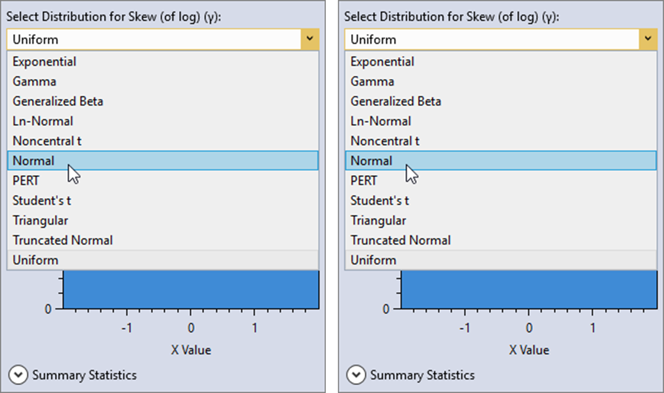
First, uncheck the Use Default Flat Priors checkbox located on the General tab of the Properties Window. Then, click the distribution button for the skew (of log) parameter. A distribution selector will pop open to the left of the button, as shown in Figure.
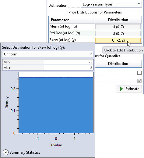
Next, select the Normal distribution and set the mean to be -0.17 and the standard deviation to be 0.35 as shown below.
Click away from the distribution selector popup and it will automatically close. You will now see that the prior distribution for skew has been set as . Now, click the Estimate command button to perform the Bayesian analysis using the informative prior.
When the simulation is complete, click on the Kernel Density tab and select the Skew (of log)(γ) parameter. When we used the default flat prior, the mean of the skew (of log) was -0.3337 with a standard deviation of 0.1756. Now, with the informative prior, we can see that the mean of the skew (of log) is -0.3062 with a standard deviation of 0.1616. The inclusion of the regional skew information has made the skew parameter less negative and reduced the variance.
As the sample size increases, the influence of the prior distribution on posterior inferences will decrease because the data likelihood will dominate. Taking this into account, regional prior information is most valuable when the at-site sample sizes are small relative to the effective sample size of the regional information.
Priors on Quantiles
Modeled rainfall-runoff results can be incorporated into the Bayesian analysis by defining a prior distribution for a flood quantile. This approach is referred to as causal information expansion, which analyzes the generating mechanisms of floods in the catchment of interest (Merz and Blöschl, 2008) [?].
A regional precipitation-frequency analysis was performed for the Blakely Mountain watershed, and 3-day basin-average rainfall-frequency events were routed using a calibrated HEC-HMS model. The main benefit of modeling regional rainfall-frequency information is that available rainfall records are often much longer than the at-site flood records. Therefore, the regional information combined with causal rainfall-runoff modeling can provide important prior information on the flood quantiles.
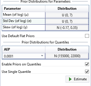
Use Single Quantile
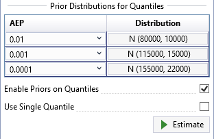
Prior distributions for flood quantiles can be set in one of two ways. First, check the Enable Priors on Quantiles checkbox located on the General tab of the Properties Window. By default, the Use Single Quantile checkbox will also be checked. For more details on this single quantile approach, please refer to (Viglione et al., 2013) [?] and (Skahill et al., 2016) [?].
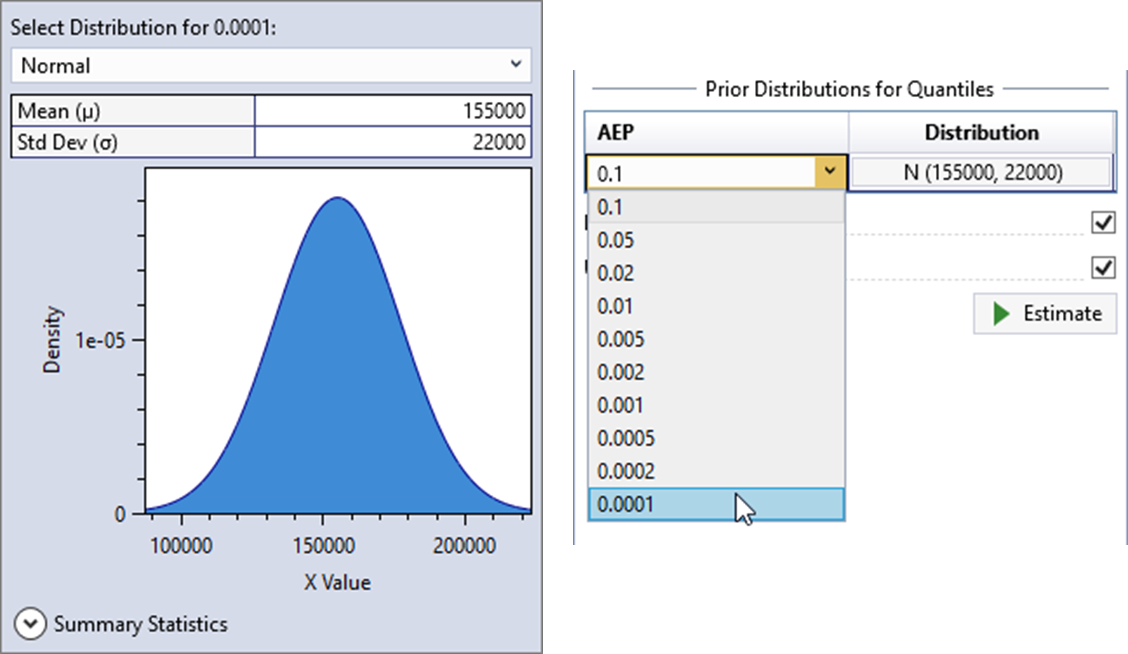
From the analysis performed with HEC-HMS, the distribution of rainfall-runoff at the 1E-4 AEP was determined to be Normally distributed with a mean of 155,000 cfs and a standard deviation of 22,000 cfs. This rare AEP was selected because in order to add information to the fit, it needed to be rarer than the paleoflood event, while not being so rare as to be overly influential.
Click the distribution button and a distribution selector will pop open to the left of the button as shown in Figure. The Normal distribution is the only option available for priors on quantiles. Next, set the mean to be 155,000 and the standard deviation to be 22,000. Click away from the distribution selector popup and it will automatically close. Now, select the 0.0001 AEP as shown below in Figure.
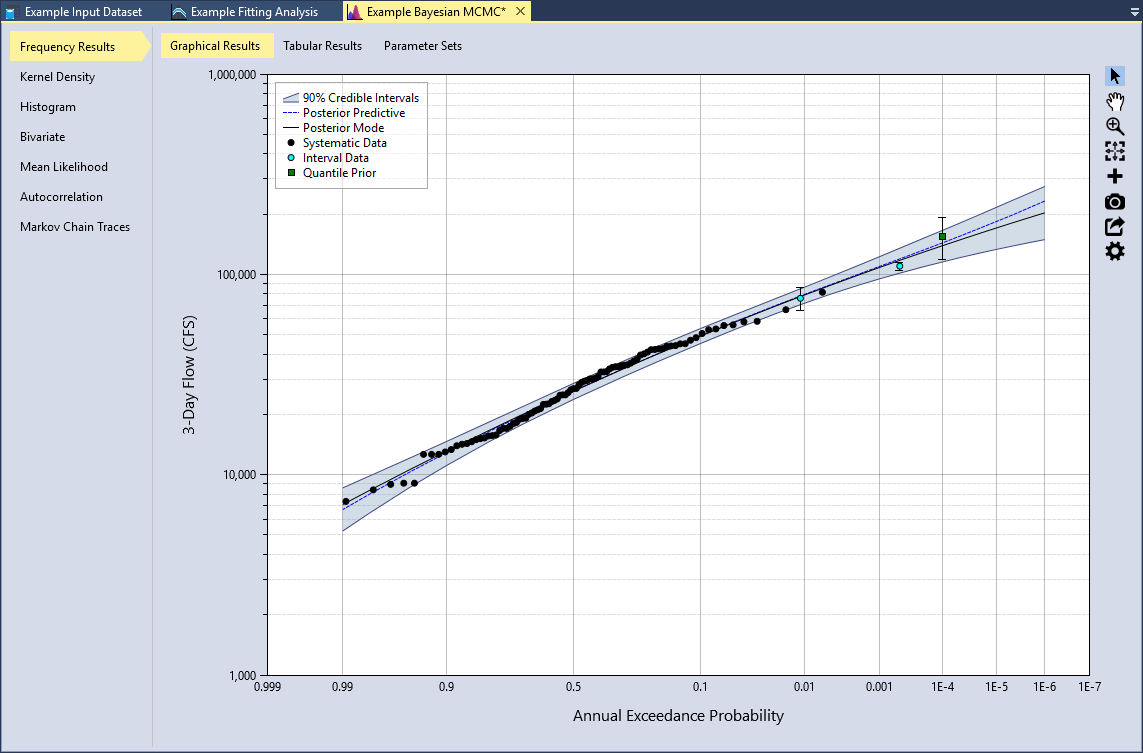
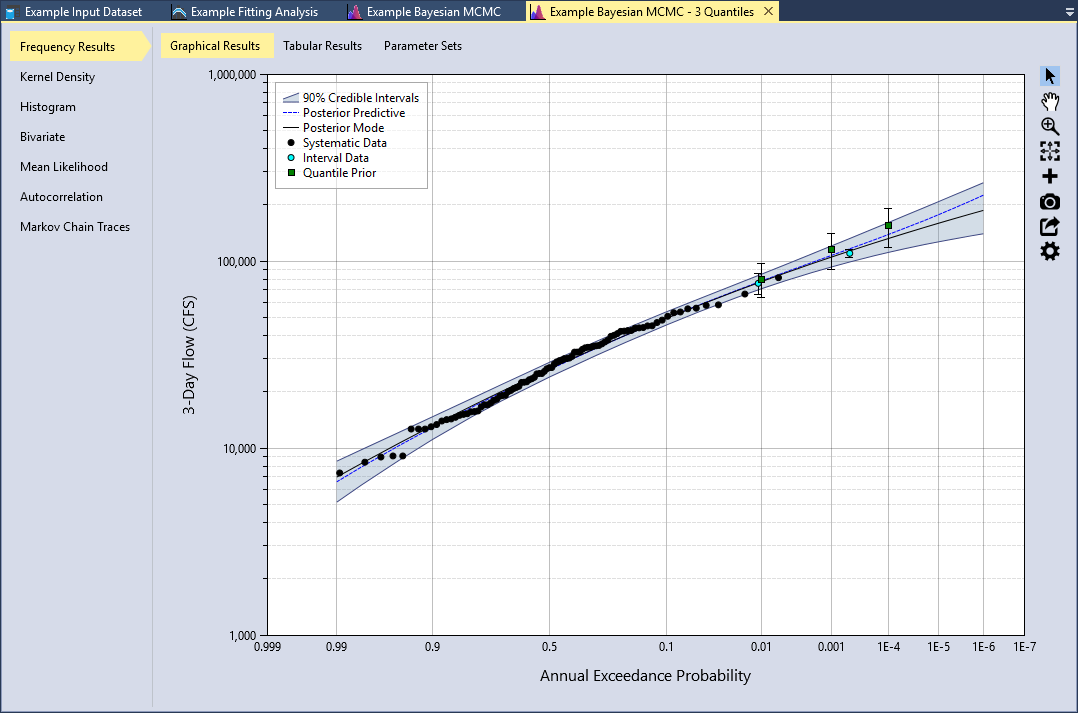
You will now see that the prior distribution for the quantile has been set to . Now, click the Estimate command button to perform the Bayesian analysis using the informative quantile prior. When the analysis is complete, you will see the frequency curve with credible intervals appear in the Frequency Results plot located in the Tabbed Documents area. The mean of the quantile prior will be displayed as a green square, and the 5th and 95th percentiles of the prior will be shown as a vertical error bar, as shown in Figure.
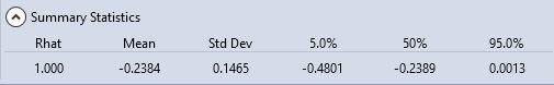
If we click on the Kernel Density tab and select the Skew (of log)(γ) parameter, we can see that the mean of the skew (of log) is -0.2384 with a standard deviation of 0.1465. The inclusion of the causal rainfall-runoff information has made the skew parameter significantly less negative, reduced the variance, and reduced the width of the resulting credible intervals of the Frequency Results.
Use Multiple Quantiles
The final way to set prior distributions for flood quantiles is to uncheck the Use Single Quantile checkbox. This option for setting priors on distribution quantiles follows the approach used in (Coles and Tawn, 1996) [?]. The number of quantile priors must be equal to the number of distribution parameters. For example, for the LPIII distribution there must be three quantile priors.
In the single quantile approach shown above, the choice of AEP for the prior information has a large influence on the resulting fit and credible intervals. If a more frequent quantile is chosen, such as 1E-2, more weight would be given to the historical and paleoflood data and the quantile prior would have less influence on the fit. Whereas, the choice of the 1E-4 quantile gives significant weight to the prior. Choosing a rare quantile implies that we have high confidence in the regional precipitation-frequency analysis and modeled rainfall-runoff results. In general, the rarer the chosen quantile for the prior information, the more influence it will have on the posterior results.
As a general rule of thumb, if you are using NOAA Atlas 14 (A14, https://hdsc.nws.noaa.gov/hdsc/pfds/pfds_map_cont.html) precipitation-frequency data with a three parameter distribution, such as LPIII, then you should enter quantile priors for 1E-1, 1E-2, and 1E-3. However, if you have performed a custom regional precipitation-frequency analysis that is believed to be of higher quality than A14, you should enter priors for 1E-2, 1E-3, and 1E-4.
In the case of Blakely Mountain Dam, a custom regional analysis was performed for the nearby Trinity River Basin in Texas, which is described in (MetStat, Inc., 2018) [?]. The regional frequency analysis performed for the Trinity River Basin also included the geographical region where the Blakely Mountain watershed is located in Arkansas. This study incorporated advanced techniques, such as storm typing; therefore, the results are considered to provide a better extrapolation to rare exceedance probabilities than A14.
Using the results from the HEC-HMS analysis, the distribution of rainfall-runoff for the 1E-2, 1E-3, and 1E-4 AEP quantiles are shown in Figure. After you have entered these prior distributions, click the Estimate command button to perform the Bayesian analysis. The Frequency Results plot is shown below in Figure.
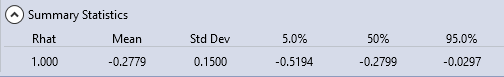
If we click on the Kernel Density tab and select the Skew (of log)(γ) parameter, we can see that the mean of the skew (of log) is -0.2779 with a standard deviation of 0.1500. The use of multiple quantiles has still made the skew parameter less negative and reduced the variance. However, the effect is less noticeable as compared to what we saw with the single quantile option. With this in mind, the single quantile option has a potential to underestimate the true parameter and quantile variance. The multiple quantile prior method provides a more complete treatment of the priors, and is considered a better choice when the data is available.
As we saw in the regional skew example, when the at-site sample size increases, the influence of the prior distribution on posterior will decrease because the data likelihood will dominate. Taking this into account, prior information on quantiles is most valuable when the at-site sample sizes are small relative to the effective sample size of the regional precipitation-frequency and causal rainfall-runoff information. For further information on setting informative priors for quantiles, please see (Coles and Tawn, 1996) [?], (Smith, 2005) [?], (Viglione et al., 2013) [?], and (Skahill et al., 2016) [?].
You have now finished the example application with RMC-BestFit. Save the project by selecting File > Save, or by clicking the Save button on the main window Tool Bar.